
Friday, 4 April 2014
Email to DCAS showing them our music video
Today we emailed DCAS studios to show them our final music video (that features their recording studio), and also to thank them again for letting us use their facilities.
Wednesday, 2 April 2014
Media Evaluation Question 4 – How did you use media technologies in the construction and research, planning and evaluation stages?
Slideshow I have created in response to evaluation question 4
Sunday, 30 March 2014
Saturday, 29 March 2014
Evaluation Question 3 - What have you learned from your audience feedback?
For this question we worked as a group. We decided to create a news report in order to answer the question.
Tuesday, 25 March 2014
Evaluation question 2: How effective is the combination of your main product and ancillary products?


- In our music video, the colour blue is featured predominantly. Therefore, when creating our ancillary products we attempted to create continuity with this theme by also using blue colours.
As the wall is blue in the performance section, we decided to continue this on the key features of the website; the writing and the photograph.
We added this continuity in an attempt to help the audience establish a relationship between the two products. This is important because it helps the audience identify features of the band. It is also an effective marketing strategy as the audience can easily identify the bands CD in shops and online.
 A key aspect in our music video was the focus on the female character. Therefore, we decided that it would be important to keep this focus a main aspect of the CD cover.
We believe this was important because it would allow an audience to easily identify the band from the video if they had seen the CD cover, or for them to identify the CD cover if they had seen the music video.

However, as the girls face is not seen in the CD cover, the continuity may not be as effective to a passive audience. We chose to do this because we felt that it fit in better with the genre of the band (Indie/Indie Pop), where the focus is usually not on the artists.

We also used the same colour scheme for the CD cover and website. There is a turquoise colour which features on both, as well as the grey background

Below is a prezi that we have also created in response to this evaluation question
By Misha and Molly
By Misha and Molly
Thursday, 20 March 2014
Evaluation Question 1 - PART 2: In what ways does your media product use, develop or challenge forms and conventions of real media products?
Here is the second part to Evaluation Question 1 that I have completed using the website Mixbook
 | Start your own Photo Books | Create custom Christmas Cards
http://www.mixbook.com/photo-books/interests/misha-evaluation-question-1-10444391?vk=mK4wXkUjgU
| Start your own Photo Books | Create custom Christmas Cardshttp://www.mixbook.com/photo-books/interests/misha-evaluation-question-1-10444391?vk=mK4wXkUjgU
Wednesday, 19 March 2014
Evaluation Question 1 - PART 1: In what ways does your media product use, develop or challenge forms and conventions of real media products?
Analysing my music video with reference to Goodwin's theory of 'Genre conventions of the music video'
1) Different genres of music demonstrate their own music video conventions
Music videos feature/are encoded with different conventions according to which genre the music video/song belongs to. Our music video for She Moves In Her Own Way is of the Indie/Indie Pop genre. In a previous research post I concluded that most Indie music videos use the following music video conventions...
 (performance/narrative)


2) There is a relationship between lyrics and visuals
My music video both uses and challenges this part of the theory.
The song is called She Moves In Her Own Way and I personally think the lyrics are about the lead singers new girlfriend/love interest, and he is singing about his new relationship while also reminiscing about his old relationship (that wasn't a good one!).
The chorus of the song is - Well oh oh, oh I love her because she moves in her own way. Well oh oh, oh she came to my show just to hear about my day.
In the music video on the end chorus, the lead singer of the band is seen serenading his girlfriend in the recording studio; here there is a clear relationship between the lyrics and visuals because he is singing the song (that's about her) to her - Uses this part of the theory

3) There is a relationship between music and visuals
She Moves In Her Own Way is a light hearted upbeat song, therefore me and my group wanted the music video to reflect the song by also being light hearted with an upbeat pace.
The music video contains both performance shots (in the recording studio) and narrative shots (outside with his girlfriend). The narrative is very loose as it's not an actual story, it's short snippets of the couple out in the countryside one day. Me and my group decided to use a loose storyline (rather than a complicated one) as we felt that it would reflect the song better and be easier/more enjoyable for the audience to watch. At first my group decided the idea for the video would be a story about his previous bad relationship and his new better relationship, but after more planning we realised that the idea was too complex for the nature of the song, and we were wary that the audience might not understand the concept properly. With this in mind we changed the idea to focus on just one relationship, and I feel like this is much more effective as it makes the music video nicer to watch.
The song has an upbeat pace to it and we have edited many of the shots to change on the beat. However we haven't stuck to this rhythm of editing throughout the whole song as other shots are longer and do not cut to the next shot on the beat, We decided to do this as we wanted to mix it up so that the music video was more interesting for the viewer to watch; additionally we wanted the audience to feel drawn in to watching the relationship we were showing and so longer shots helped us to do this successfully - we know this because of audience feedback. When we were asking our audience questions about the music video many people told us that they thought the relationship was cute, and others asked if they were a real couple.
4) Many close ups of the artist to emphasise the image of the start
My music video features many close ups of the lead singer in the band. In an Indie music video there doesn't tend to be many close ups of the artist, this is because Indie bands/artists (in comparison to Pop artists) tend to focus solely on the music they produce without trying to sell themselves as a 'star'. This is different to Pop artists as the majority of pop stars try to sell/market themselves as much as they try to sell their music (this results in Pop music videos featuring many close up shots of the artist). However, The Kooks are in the Indie Pop genre so I wouldn't say that we have completely challenged this part of the theory as the band have a small element of Pop in their music.
We wanted to include many close up shots of the artist as we felt it was relevant to the song lyrics - he is singing about his own new relationship; therefore the close up shots help to establish to the audience that the lead singer has written this song (his own song) with his new girlfriend in mind.


Many Indie (Indie Pop) bands write their own songs so by including close ups of Dom we have tried to encode the music video with the message that the lead singer/band have written their own original song. As well as close ups of the lead singer and band members we have included close ups on the instruments that are being played; again this highlights to the audience that the band are in the Indie/Indie Pop genre as they are playing their own instruments while recording the song.

5) Frequent reference to the notion of looking, and voyeuristic treatment of the female body
This idea does not apply to my music video and in some ways it challenges it. I think that 'the notion of looking' in music videos tends to make the video look slightly fake and exaggerated - and for the genre of the song I didn't feel like it was appropriate to use shots of the artist/band looking for no reason. We wanted the music video to look real and very natural, like the band were just recording their song (performance) and like Izzy and Dom were having a nice day out (narrative). Therefore we deliberately didn't include shots of the artist looking as it would have detracted from the simple/natural feel of our music video.
Additionally there is no voyeuristic treatment of the female body in the music video. We wanted the female character to be viewed as being sweet and innocent, as this ties in well with the 'young love' storyline. Therefore this wouldn't of been appropriate.
6) There are often intertextual references to films/other music videos etc
We wanted to use an intertextual reference within our music video, and after thinking of a few ideas we decided to use a reference to the film Titanic. We have recreated the famous scene in which Jack and Rose are stood at the front of the boat and Rose is 'flying'.


1) Different genres of music demonstrate their own music video conventions
Music videos feature/are encoded with different conventions according to which genre the music video/song belongs to. Our music video for She Moves In Her Own Way is of the Indie/Indie Pop genre. In a previous research post I concluded that most Indie music videos use the following music video conventions...
- Dim low lit locations
- Locations with a mysterious feel to them
- Performance scenes
- Narrative
- Low colour saturation - this gives the video it's 'vintage' feel
- Emphasis on the band/artists Indie style - skinny jeans, baggy tee, messy hair
- Certain behaviour such as smoking, drinking alcohol and sex
- Not too serious, often scenes with the band/artist acting silly, e.g. - comical dancing
Our music video has used some of these conventions, however the video also challenges some of these conventions. We have challenged the convention of using low lit locations; we wanted to use brighter locations/light as we felt this would fit better with the upbeat, light-hearted nature of the song.
It could be argued that we have used mysterious locations (the shots filmed in the woods) as the narrative sections show the two characters alone in the middle of the countryside with no one else around; however I personally do not think the location is 'mysterious'.
We have used the convention of combining performance with narrative; we have used a 50/50 split of shots in the recording studio (the band recording/performing the song) and shots of the couple enjoying a day in the countryside.
(performance/narrative)
Another convention of Indie music videos is using a low colour saturation - we chose to use this convention. We added an effect on Adobe Premiere Pro to make the video colours look warmer. However we only did this slightly as the genre of our music video is Indie Pop (not just Indie), therefore we didn't want to make it look too Indie, as the Pop element of the song is just as important. Therefore we chose to use natural colours/colour saturation so that the music video can be easily placed into both the Pop genre, the Indie genre and of course the Indie Pop genre.
Emphasis on the bands style - we tried to use this convention by paying a lot of attention to what our actors wore. We briefed them before filming and told them to wear skinny jeans with either a shirt, polo shirt, jacket/denim jacket. As well as this we picked our actors while thinking about who would look best in an Indie Pop band. We wanted the band members to look a certain way as real Indie band members have similar looks/style.
We have not used the convention of featuring behaviours like smoking/drinking alcohol. This wouldn't have fit well with the song as the song is about the lead singers new love interest.
Finally we have used the convention of featuring comical scenes. In the music video we show the couple dancing around near a lake, as well as this the band are seen messing around in the recording studio. We chose to use this convention as the light-hearted nature of the song fits well with this.
2) There is a relationship between lyrics and visuals
My music video both uses and challenges this part of the theory.
The song is called She Moves In Her Own Way and I personally think the lyrics are about the lead singers new girlfriend/love interest, and he is singing about his new relationship while also reminiscing about his old relationship (that wasn't a good one!).
The chorus of the song is - Well oh oh, oh I love her because she moves in her own way. Well oh oh, oh she came to my show just to hear about my day.
In the music video on the end chorus, the lead singer of the band is seen serenading his girlfriend in the recording studio; here there is a clear relationship between the lyrics and visuals because he is singing the song (that's about her) to her - Uses this part of the theory
However, the music video predominantly challenges the theory. Music videos often have a clear relationship between the lyrics and visuals as it makes the video easier to follow. Our music video challenges this idea by not using specific shots/mise en scene that matches directly to the lyrics. Instead we decided to keep it simple by making the narrative shots of the lead singer and his new girlfriend having fun on a day out in the countryside. The versus' of the song concentrate more on his ex-girlfriend rather than his current girlfriend; as he is comparing his new relationship to his old one and has realised that he loves his new girlfriend because she is very different to his previous one. However, our music video does not feature his old love interest so we have challenged the theory - we wanted the music video to be about one girl (not two) so that the audience didn't get confused by a complicated storyline, so for nearly all of the song there is not a direct relationship between the lyrics and visuals. - Challenges this part of the theory
3) There is a relationship between music and visuals
She Moves In Her Own Way is a light hearted upbeat song, therefore me and my group wanted the music video to reflect the song by also being light hearted with an upbeat pace.
The music video contains both performance shots (in the recording studio) and narrative shots (outside with his girlfriend). The narrative is very loose as it's not an actual story, it's short snippets of the couple out in the countryside one day. Me and my group decided to use a loose storyline (rather than a complicated one) as we felt that it would reflect the song better and be easier/more enjoyable for the audience to watch. At first my group decided the idea for the video would be a story about his previous bad relationship and his new better relationship, but after more planning we realised that the idea was too complex for the nature of the song, and we were wary that the audience might not understand the concept properly. With this in mind we changed the idea to focus on just one relationship, and I feel like this is much more effective as it makes the music video nicer to watch.
The song has an upbeat pace to it and we have edited many of the shots to change on the beat. However we haven't stuck to this rhythm of editing throughout the whole song as other shots are longer and do not cut to the next shot on the beat, We decided to do this as we wanted to mix it up so that the music video was more interesting for the viewer to watch; additionally we wanted the audience to feel drawn in to watching the relationship we were showing and so longer shots helped us to do this successfully - we know this because of audience feedback. When we were asking our audience questions about the music video many people told us that they thought the relationship was cute, and others asked if they were a real couple.
4) Many close ups of the artist to emphasise the image of the start
My music video features many close ups of the lead singer in the band. In an Indie music video there doesn't tend to be many close ups of the artist, this is because Indie bands/artists (in comparison to Pop artists) tend to focus solely on the music they produce without trying to sell themselves as a 'star'. This is different to Pop artists as the majority of pop stars try to sell/market themselves as much as they try to sell their music (this results in Pop music videos featuring many close up shots of the artist). However, The Kooks are in the Indie Pop genre so I wouldn't say that we have completely challenged this part of the theory as the band have a small element of Pop in their music.
We wanted to include many close up shots of the artist as we felt it was relevant to the song lyrics - he is singing about his own new relationship; therefore the close up shots help to establish to the audience that the lead singer has written this song (his own song) with his new girlfriend in mind.
Many Indie (Indie Pop) bands write their own songs so by including close ups of Dom we have tried to encode the music video with the message that the lead singer/band have written their own original song. As well as close ups of the lead singer and band members we have included close ups on the instruments that are being played; again this highlights to the audience that the band are in the Indie/Indie Pop genre as they are playing their own instruments while recording the song.
5) Frequent reference to the notion of looking, and voyeuristic treatment of the female body
This idea does not apply to my music video and in some ways it challenges it. I think that 'the notion of looking' in music videos tends to make the video look slightly fake and exaggerated - and for the genre of the song I didn't feel like it was appropriate to use shots of the artist/band looking for no reason. We wanted the music video to look real and very natural, like the band were just recording their song (performance) and like Izzy and Dom were having a nice day out (narrative). Therefore we deliberately didn't include shots of the artist looking as it would have detracted from the simple/natural feel of our music video.
Additionally there is no voyeuristic treatment of the female body in the music video. We wanted the female character to be viewed as being sweet and innocent, as this ties in well with the 'young love' storyline. Therefore this wouldn't of been appropriate.
6) There are often intertextual references to films/other music videos etc
We wanted to use an intertextual reference within our music video, and after thinking of a few ideas we decided to use a reference to the film Titanic. We have recreated the famous scene in which Jack and Rose are stood at the front of the boat and Rose is 'flying'.
Although the shot is very short I feel like it adds a small bit of humour to the video, in which the audience will find humourous if they have seen the film. Many of the people we have showed the music video to have picked up on the intertextual reference and said that they find it amusing.
Goodwin's theory also states that music videos are either performance, narrative or concept based; our music video is a mix of performance and narrative. We decided to use a mix of the two so that the video was more varied, and thus more interesting for the viewer to watch. In the early stages of planning we had the idea to make the music video completely performance based, however we came to the decision that this would limit us as we weren't able to find many locations that were suitable for performance based shots.
Some of our audience might interpret the idea of our music video differently, and they may think that it is only narrative based - the performance shots of the band are in a recording studio, so this could be interpreted as being a 'story' of the band recording their song rather than an actual performance. This links to Halls 'Reception Theory'; the theory states that the audience play an active role in reading texts/products, and that each individual has the ability to interpret the same text/product differently.
Monday, 10 March 2014
Audience feedback video
Today we collected some audience feedback by showing some people our finished music video and then asking them questions. We asked 4 people a series of questions in order to gain audience feedback so that we could efficiently answer Evaluation Question 3: What have you learned from your audience feedback?
We worked on this video as a group
We worked on this video as a group
Saturday, 1 March 2014
Website
Here is the link to our website - WEBSITE (http://mishaarmstrong.wix.com/thekooks)


We decided to use a bright(ish) colour scheme of grey, turquoise, pink and white - as The Kooks are an Indie Pop Band; therefore we didn't want the website and CD digipack to look too Indie/Rock (e.g. - black and white colour scheme) so we chose to incorporate bright colours with darker colours in order for a viewer of the website and CD cover to know what genre the band is.
The website used the CD cover picture of the female in the music video as the background of the website (circle picture on a white background) - using the picture makes the website look like an Indie Pop website, as well as creating a link between the music video, website and digipack.
We have made a homepage and also a page for 'Gigs' and 'Photos'. The website homepage includes a picture slideshow of the bands, some brief information on upcoming gigs, some news, a banner for the website visitor to sign up to the bands mailing list, and finally an advertisement for the single 'She Moves In Her Own Way'.
We have tried to make the website appear as life like as possible by including links/buttons to Twitter, Facebook, YouTube and SoundCloud. There are also links to 'buy tickets' to the numerous gigs listed.
Friday, 28 February 2014
CD digipack
Below is the CD digipack for the music video we have created.
****** Printscreens taken in publisher, that is why there is boxes around the text and logos etc..
FRONT AND BACK COVER
Back Front


We wanted there to be a link between the CD and the website, so we have used similar colours; this means that a person/fan would distinguish a link between the 2 things e.g. - if a fan had previously seen the website and then saw the CD cover in a shop they would instantly recognise the 'theme and would know that the CD is a product of The Kooks.
****** Printscreens taken in publisher, that is why there is boxes around the text and logos etc..
FRONT AND BACK COVER
Back Front
CD INSERT
PAGE 1
PAGE 2
The digipack uses a picture of the female in the music video on the front cover, this means that if a fan had watched the video they would make a connection between the music video and CD cover.
We have changed the saturation of the front cover picture to make it look more vintage, which fits in with the Indie genre.
We have changed the saturation of the front cover picture to make it look more vintage, which fits in with the Indie genre.
The back of the digipack is simple as we didn't want to make it look crowded. It features a barcode, QR code, Spotify logo and the record label logo for The Kooks - these are all typical features of a CD cover.
The inside of the CD contains a short 'thank-you' message from the band to the fans, and also an additional QR code for fans to download an exclusive track - linking to McQuail's theory 'Uses and Gratifications' this would make the fan feel a sense of belonging to a small community of fans who have purchased the hard copy single.
Tuesday, 25 February 2014


Monday, 17 February 2014
Picture for the CD Digipack
We have decided on the photo we want to use for the digipack...

We have chosen to use a picture of the female in the music video as Indie bands do not tend to use pictures of themselves as their CD cover, also the song is called 'She Moves In Her Own Way' therefore the song is about the girl so we thought it made sense to use her as the digipack front cover picture.
The picture was taken in the same location as where we filmed the outside parts of the video so the digipack will have a direct link/continuity with the video.
We are going to edit the pictures saturation/brightness to make it look more vintage/Indie. Additionally we are going to edit the picture in Photoshop to make it look as though there are 2 of the female.
Thursday, 13 February 2014
Filming today
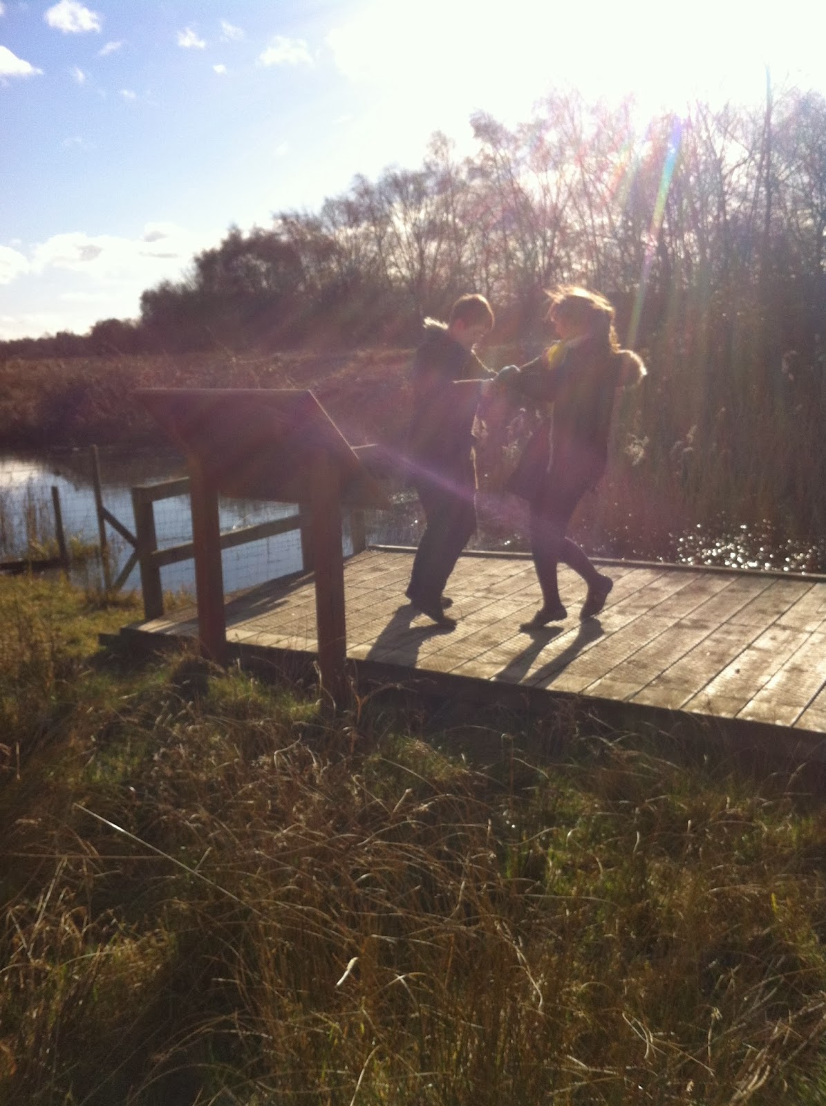
Today me and Molly filmed the remainder of the shots we needed for our music video and took the photos for the digi-pack.
We filmed them outside in a grassy area/nature trail with Dom (lead singer of the 'band') and Izzy (his love interest). We chose this location as we thought it was a nice open area to film some cute/romantic shots of the couple together.
Some photos I took while filming -


We filmed them outside in a grassy area/nature trail with Dom (lead singer of the 'band') and Izzy (his love interest). We chose this location as we thought it was a nice open area to film some cute/romantic shots of the couple together.
Some photos I took while filming -
After filming me and Molly went and edited the shots together; we have now nearly completed the music video. Our deadline is Friday 28th February (the week after half term), so when we get back after half term we need to...
- Finish the CD digi-pack/edit the photos
- Make some finishing touches to the website
- Finish editing the music video
Friday, 7 February 2014
Ancillary products
For the ancillary products we decided to create 2 different websites and 2 different CD digipacks as we found that within our group there was a difference in opinion about how the ancillary products should look e.g. -colour scheme and layout.
Therefore we decided to create 2 different websites and 2 different digipacks, and from this we are each going to choose which ancillary products we want to be marked.
Website 1


Digipack 1
Website 2


insert pages 1 and 2

insert pages 3 and 4
 Conclusion
After looking at both in detail I have decided to use website 2 and digipack 2. I have chosen to use the second set as I personally think that they fit the Indie Pop genre better than the black and white ancillary products because of the research I have done. The second website and digipack also contain other working pages (Gigs page and Photo page etc)
Therefore we decided to create 2 different websites and 2 different digipacks, and from this we are each going to choose which ancillary products we want to be marked.
Website 1
Digipack 1
Website 2
Digipack 2
back cover front cover
insert pages 1 and 2
insert pages 3 and 4
After looking at both in detail I have decided to use website 2 and digipack 2. I have chosen to use the second set as I personally think that they fit the Indie Pop genre better than the black and white ancillary products because of the research I have done. The second website and digipack also contain other working pages (Gigs page and Photo page etc)
Tuesday, 4 February 2014
Audience Research
My group decided to conduct some audience research so that we could get some useful feedback on our video so far and our website.
We asked five 16-18 years old from our sixth form to watch a rough cut of our music video, and to look at the website. We got them to write down their feedback/comments and this is what they said...
Music video feedback:
Good things about it
Website feedback:
Good things about it
We asked five 16-18 years old from our sixth form to watch a rough cut of our music video, and to look at the website. We got them to write down their feedback/comments and this is what they said...
Music video feedback:
Good things about it
- The band looked like a real band, and it looked like the main singer was actually singing/performing
- The humour was a good element in the video, made it enjoyable to watch
- Looks well put together
- There is a good range of shots which makes it not boring to watch
- Need a better quality song - we have already planned to do this when we have finished editing
- Possibly speed up the beginning of the video as it drags a little bit/is jumpy
- Could edit the video more e.g. - some shots in black and white etc
Website feedback:
Good things about it
- Links well with the video
- Good amount of information on it and it's relevant e.g. - link to Leeds festival website
- Looks like a real band page with twitter/facebook links etc
- Embed the finished music video link onto the website - have already planned to do this when we have finished editing the video
- Could be a clearer relationship between the website photos and the music video (the colour and tone of the photos/video)
- The band logo could be better
Monday, 27 January 2014
What we have been upto...
Since we filmed at DCAS we have been editing the music video and working on the website task.
We have now finished editing all the performance shots and now need to film and edit the other shots.
This week/next week (depending on the weather) we are going to be filming the rest of the shots, which are going to be filmed outside in a park/grass area. Also this week we are going to start working on the CD digipack.
Monday, 20 January 2014
Band Logo
Above is the band logo we have created, which will be featured on the website and the digipack.
We wanted the logo to be simple and bold, like that of an Indie band. We struggled with deciding on the layout we wanted and also the font/font colour, as we didn't want it to look similar to The Kooks official logo. In the end we decided on a black & white colour scheme as we thought it would look the most effective, as any bright colours could of made the logo look more Pop than Indie. We chose thin writing so that the logo is easily readable, and we chose to put the writing within a circle so that it looks like a proper logo.
Below is the real band The Kooks logo -

Tuesday, 14 January 2014
Wednesday, 8 January 2014
Filming Pictures

The 'band' performing
.jpeg)
Molly filming
.jpeg)
The band again
Today we are going to be uploading the clips to a computer and starting to look at them/edit.
Monday, 6 January 2014
Filming tomorrow
Tomorrow we are filming at DCAS at 4pm. While there we are going to be shooting the performance shots of the music video.
Checklist of what equipment we need -
2 video cameras (to film)
2 tripods
Molly's camera & tripod (to take pictures for ancillary tasks)
2 sets of lyrics
Shot list
Storyboards
Checklist of what equipment we need -
2 video cameras (to film)
2 tripods
Molly's camera & tripod (to take pictures for ancillary tasks)
2 sets of lyrics
Shot list
Storyboards
Subscribe to:
Comments (Atom)